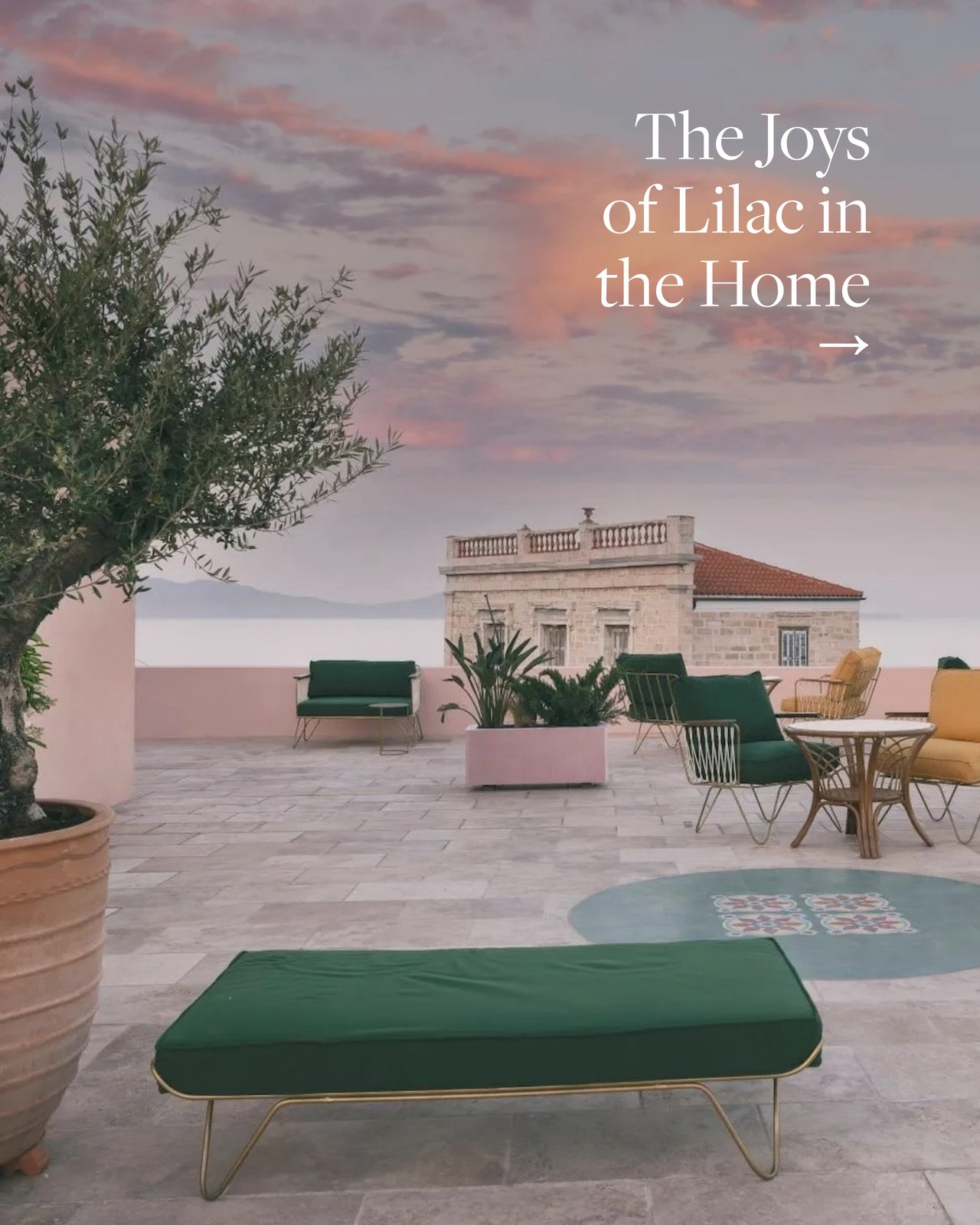
The purple-lilac spectrum is having a moment.
How to bring calm, nostalgia, and quiet drama to bedrooms, hallways, and even exteriors.
How to bring calm, nostalgia, and quiet drama to bedrooms, hallways, and even exteriors.
How to bring calm, nostalgia, and quiet drama to bedrooms, hallways, and even exteriors.
Some homes make a lasting impression while others quickly fade from memory and almost always, color has something to do with it. While green enhances old-world interiors and yellow brings a joyful lift, shades of purple and lilac occupy more complex emotional territory. Once dismissed as tricky, they are very much back in vogue, working best in homes with a period feel and a sense of history.
That history runs deep. "Purple in any form was once so rare and costly to produce that it was reserved for royalty and the church," says Stephanie Schabot, design director of New York-based Pembrooke & Ives. By the Victorian era, it had filtered into wallpapers, upholstery, and ceramics, and even carried social meaning, with widows traditionally transitioning from black mourning dress to lilac as a gesture toward renewal.
That spirit of quiet optimism never entirely left. The famed "Purple Hotel" in Lincolnwood, Illinois, a midcentury-modern landmark designed by Hungarian architect John Macsai, made the color bold and architectural. Today, the mood is softer but no less intentional.
Schabot sees clients reaching for lilac in hallways, bedrooms, and bathrooms: "places where light moves slowly and people want to feel something." With its echoes of wisteria and jacaranda blooms, lilac evokes calm, innocence, and nostalgia. "There's a real appetite right now for color that carries emotion," she says.
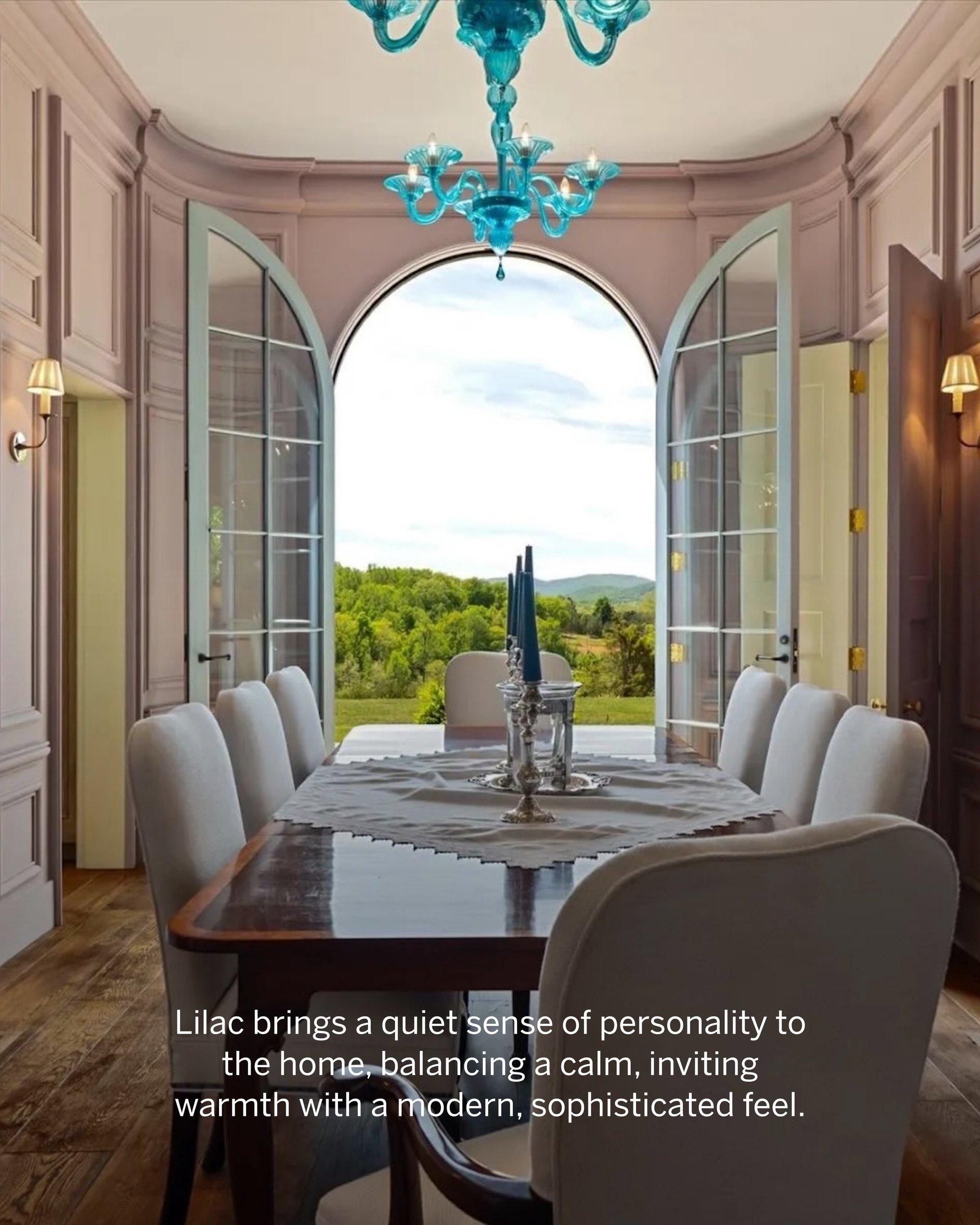
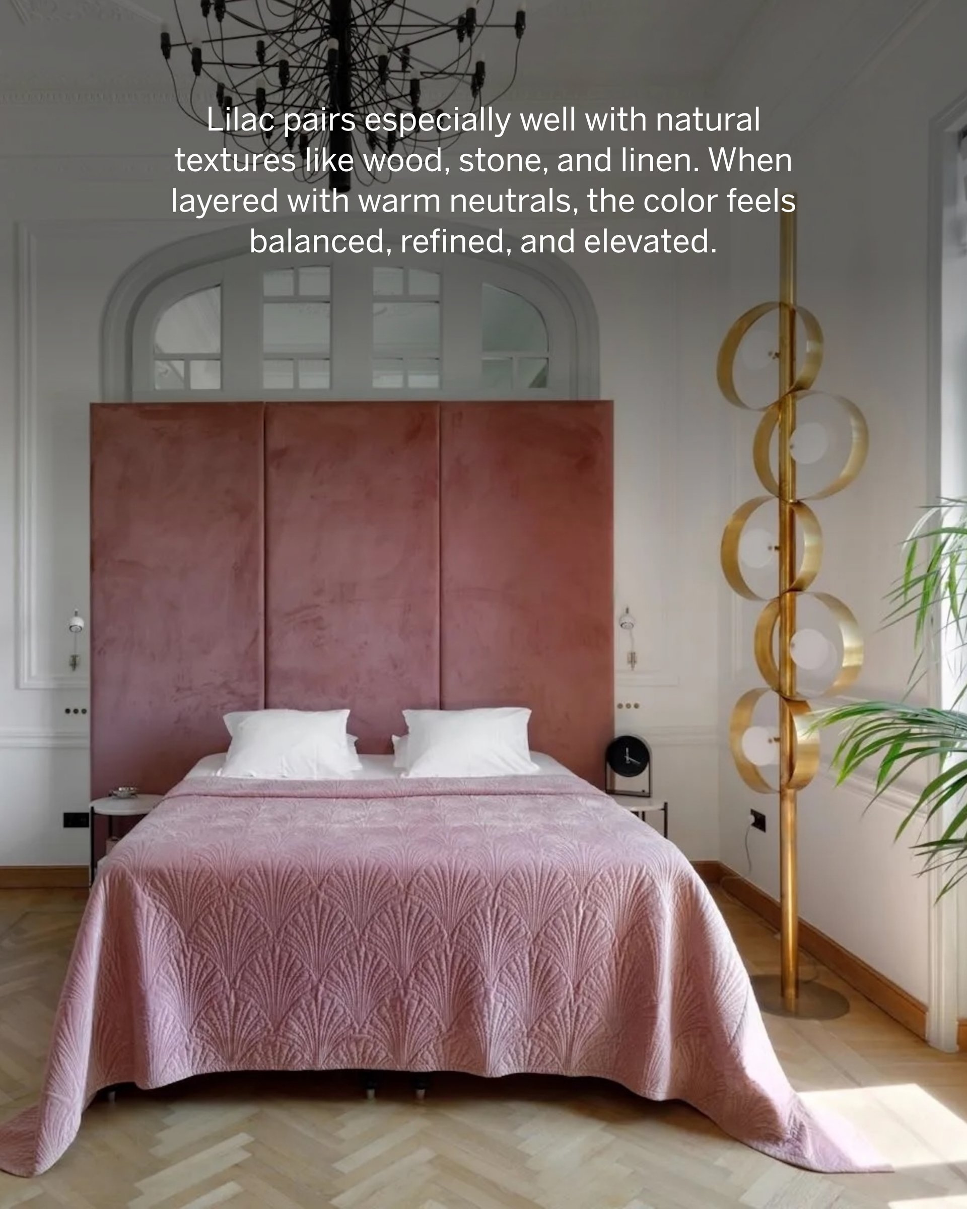
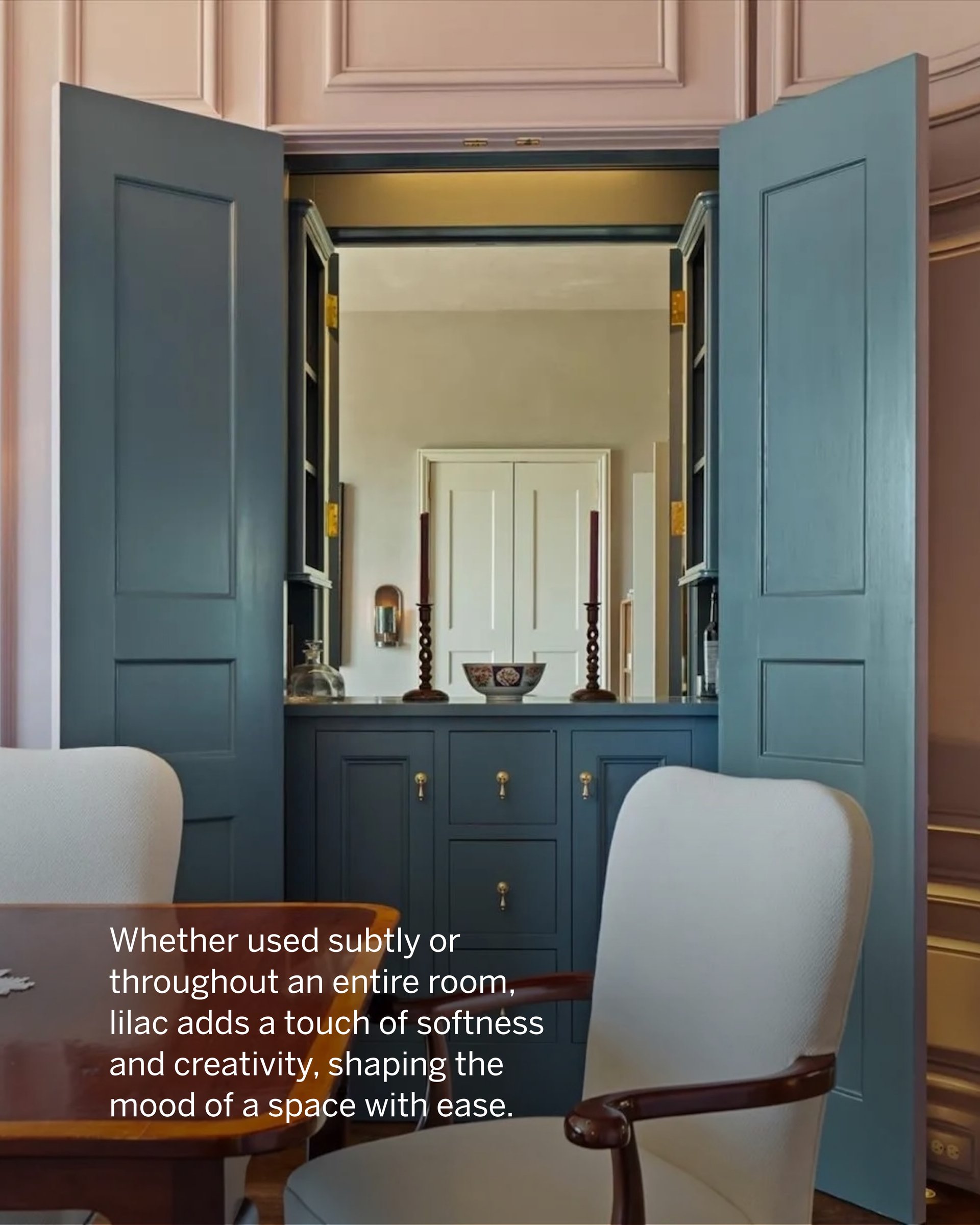
That appetite shows up across some remarkable properties. The aptly named Sunday Lilac estate in Charlottesville, Virginia features a dining room drenched in muted lilac alongside moody-blue cabinetry, a bold chandelier, and a sunburst mirror that draws warmth from the walls. A restored mansion in Ermoupolis, on the Greek island of Syros, has a lilac bedroom that mirrors the sorbet hues of an Aegean sunset. "The Aegean sky in late afternoon is lilac," Schabot notes, "and this bedroom seems to draw direct inspiration from the light and landscape." A coastal home in Lielupe, Latvia takes a similar approach, its blush bathroom reflecting the silvery light of the Baltic Sea. Even a grand Scarsdale mansion makes its statement through a grayish-lilac exterior, one that, as Schabot puts it, "breathes rather than shouts."
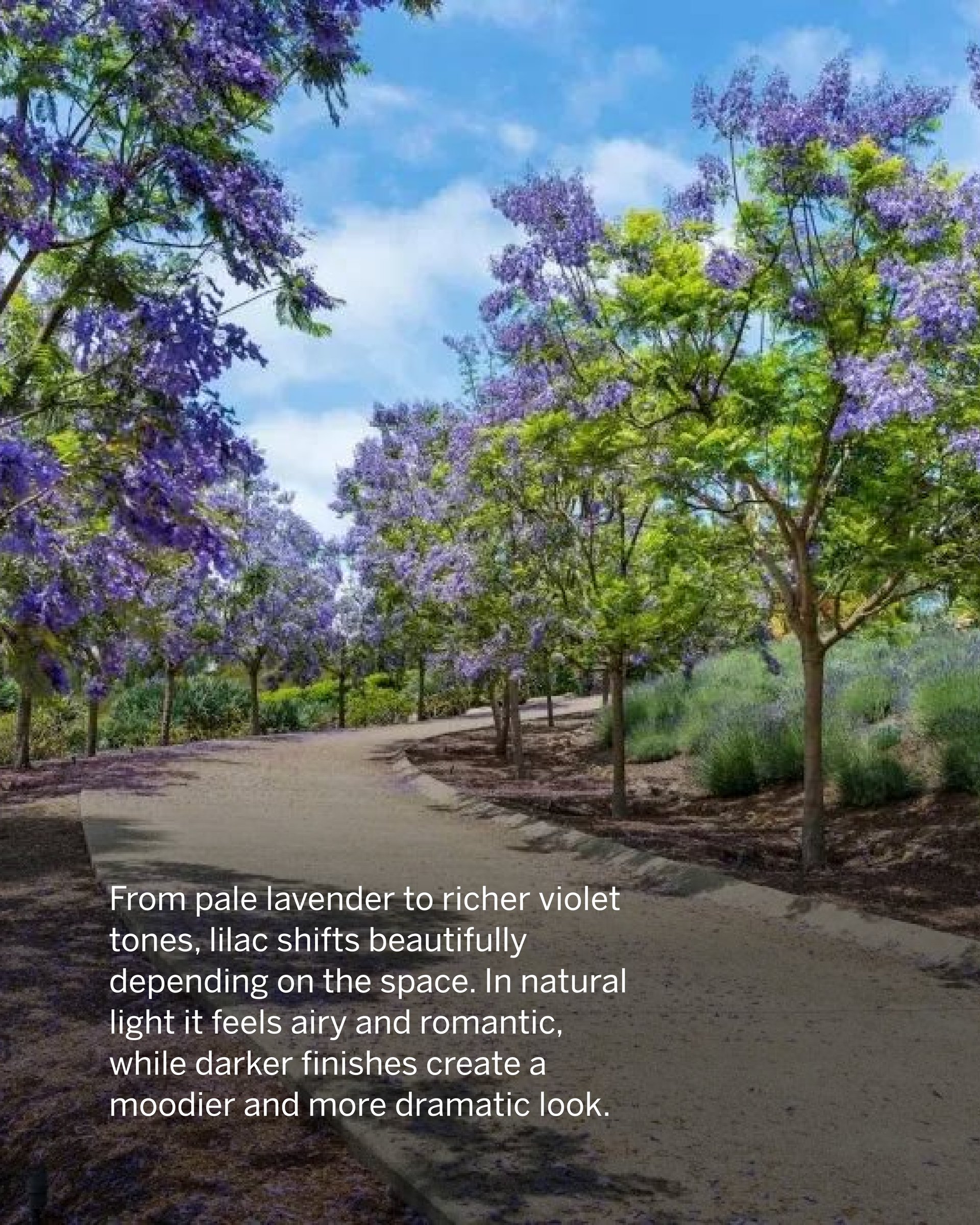
For those looking to incorporate the shade, Schabot recommends pairing lilac with warm tones that carry a blush or honey base. Her frequent go-to: Farrow & Ball's Elephant's Breath, a gray paint with a subtle magenta undertone. "Those shared warm undertones mean the two pair beautifully," she says, not unlike the jacaranda trees in full bloom lining the road to a home in Rancho Santa Fe.
Lilac, it turns out, is not a shy color. It simply knows how to whisper.
Stay up to date on the latest real estate trends.
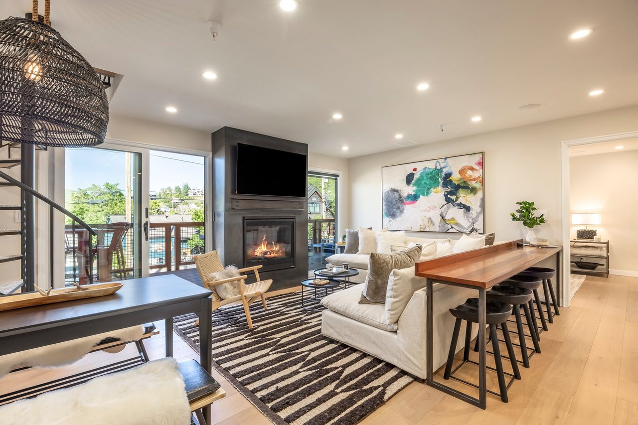
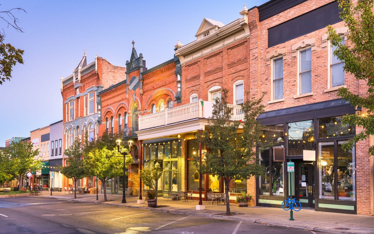
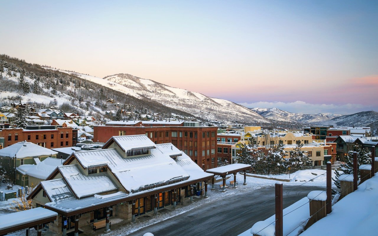
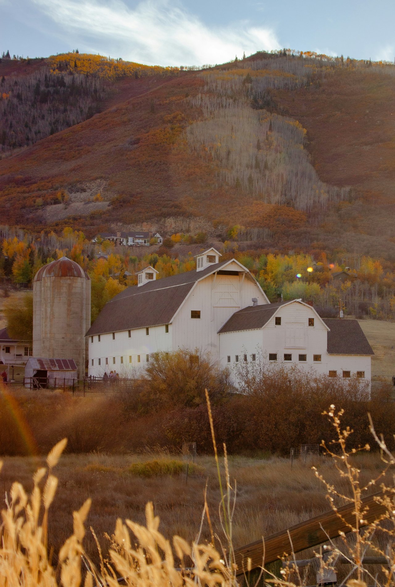
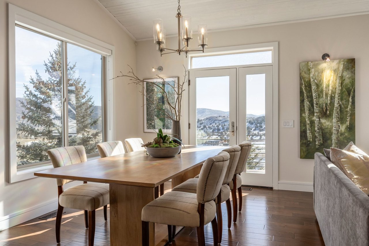
Trends in the Park City & Heber Valley Real Estate Markets

Honoring the top performing professionals and teams in the United States.
How to bring calm, nostalgia, and quiet drama to bedrooms, hallways, and even exteriors.
Real Estate Market updates for Park City, Utah


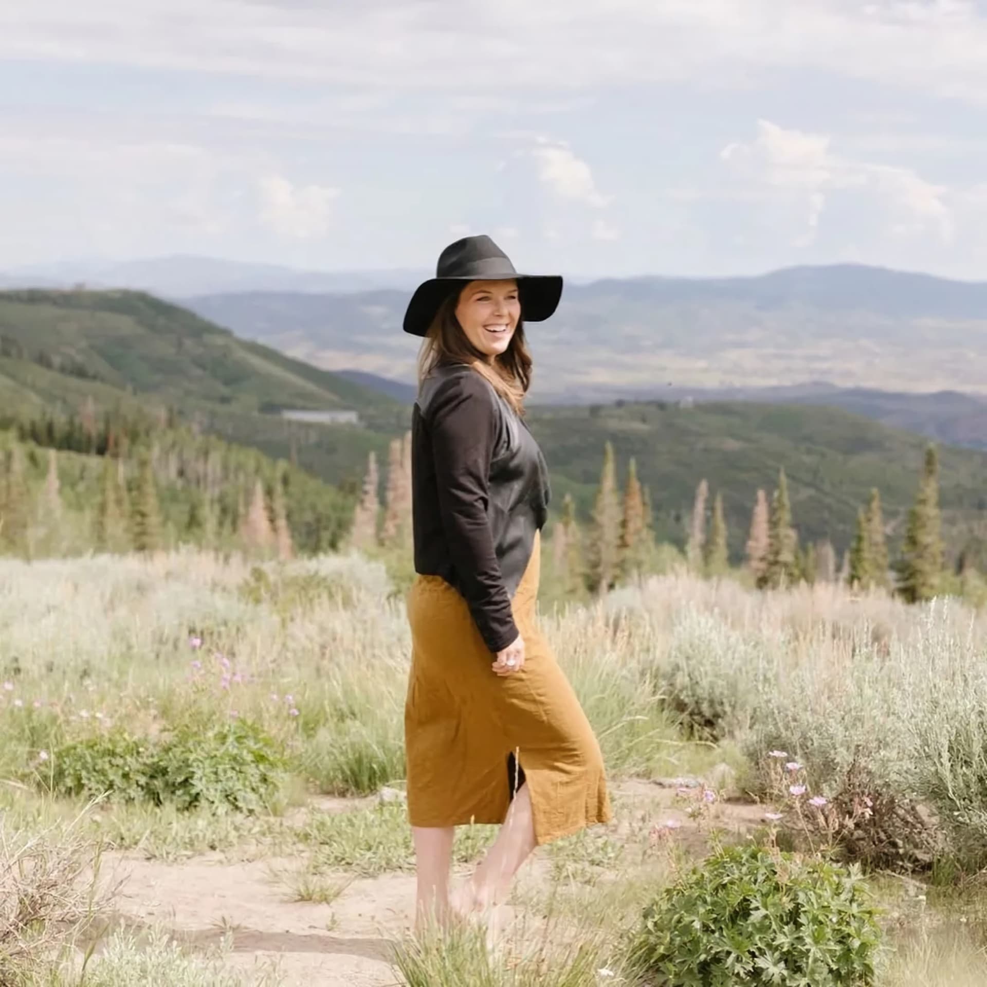
Reviewing the most current stats with Liza Story and Summit Sotheby's International Realty
With over 400 miles of single track trails in the Park City area, the options are endless.
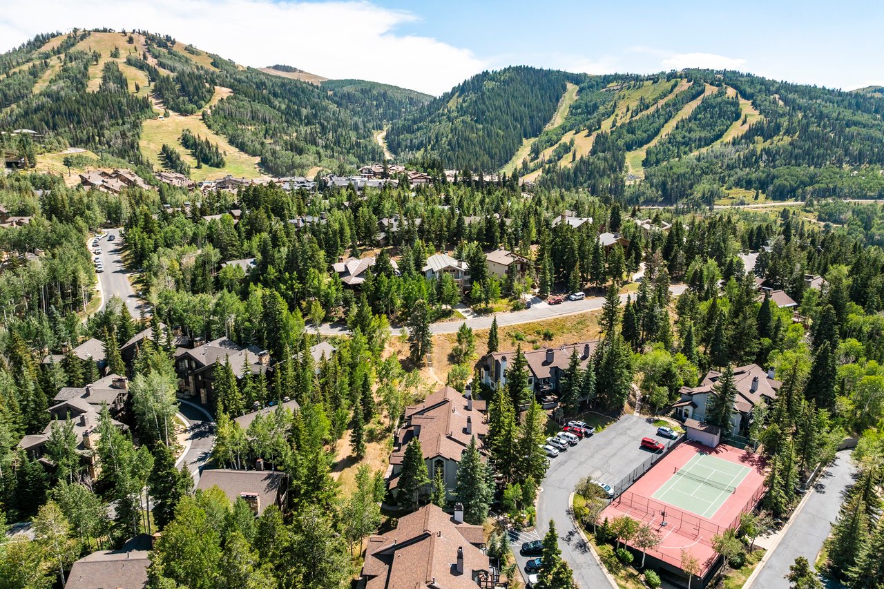
Deer Valley isn’t just one of the best ski destinations in the country — it’s also one of the most desirable places to own real estate.
Get In Touch With Liza To Learn More